While strategic logistics and partnerships are major components in ensuring a successful event, color psychology is just as important in proper planning. Cultural factors often dictate what schemes are appropriate in addition to branding, messaging, ambience, etc. However choosing the right hues and knowing the effect each shade will have on your attendees’ experience can make or break your event.
With our photo booth rentals here in Los Angeles, we incorporate a variety of colors and themes into the printed photo strips and/or green screen backgrounds. We typically receive direction from our clients’ but in some cases the creative direction is left to our design team.
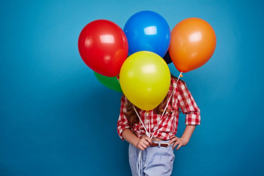
We keep mindful of colors and their association with certain qualities or emotions:
Red –excitement, strength, sex, passion, speed, danger.
Blue –(listed as the most popular color) trust, reliability, belonging, coolness.
Yellow –warmth, sunshine, cheer, happiness
Orange — playfulness, warmth, vibrant
Green — nature, fresh, cool, growth, abundance
Purple –royal, spirituality, dignity
Pink — soft, sweet, nurture, security
White –pure, virginal, clean, youthful, mild.
Black –sophistication, elegant, seductive, mystery
Gold — prestige, expensive
Silver — prestige, cold, scientific
In an effort to keep the creative juices flowing, we take a look at a few color trends for 2015 that can be applied to event design and themes:
Color Blocking – is most familiar in the fashion industry but can easily be applied to event decor. It is when you pair two or three (usually opposing) colors to make a bold statement. For successful color blocking, keep your colors in the same family such as all pastels or all neon colors. If your clients want to incorporate hints of color blocking, consider using it with place cards, favors or on their menu cards.
En Plain Air – combines “an eclectic, ethereal mix of understated brights, pale pastels and nature-like neutrals”. Leatrice Eiseman Executive Director, Pantone Color Institute says, “Many feel compelled to be connected around the clock because we are afraid we’ll miss something important. There is a growing movement to step out and create ‘quiet zones’ to disconnect from technology and unwind, giving ourselves time to stop and be still. Color choices follow the same minimalistic, ‘en plein air’ theme, taking a cue from nature rather than being reinvented or mechanically manipulated. Soft, cool hues blend with subtle warm tones to create a soothing escape from the everyday hustle and bustle.”
Futuristic Metallics – depending on your audience and messaging, the use of shiny metallics puts people in the mindset of innovation while matte tones imply sophistication and taste.
For more ideas, click over to Endless Entertainment.